 | |||
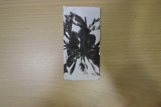
| Iphone Casing. |
Kelvin H'ng
Thursday, 31 January 2013
Tuesday, 22 January 2013
Batik
Silhouettes
A silhouette is the image of a person, an object or scene
represented as a solid shape of a single color, usually black, its edges
matching the outline of the subject. The interior of a silhouette is
basically featureless, and the whole is typically presented on a light
background, usually white, or none at all. The silhouette differs from
an outline
which depicts the edge of an object in a linear form, while a
silhouette appears as a solid shape. Silhouette images may be created in
any visual artistic media.
Cutting portraits, generally in profile, from black card became popular in the mid-18th century, though the term “silhouette” was seldom used until the early decades of the 19th century, and the tradition has continued under this name into the 21st century. From its original graphic meaning, the term "silhouette" has been extended to describe the sight or representation of a person, object or scene that is backlit, and appears dark against a lighter background. Anything that appears this way, for example, a figure standing backlit in a doorway, may be described as "in silhouette". Because a silhouette emphasises the outline, the word has also been used in the fields of fashion and fitness to describe the shape of a person's body or the shape created by wearing clothing of a particular style or period.
________________________________________________________________________________________
My Silhouette (Haircut)
Tessellation
Tessellation is the process of creating a two-dimensional plane using the repetition of a geometric shape with no overlaps and no gaps. Generalizations to higher dimensions are also possible.
 | ||
| Figure and Ground (Fishes) |
 |
| Closure (Guitar) |
 |
| Similarity (Cigarette's smell) |
 |
| Continuity (Running Man) |
 |
| Alignment (Birds) |
The Paper Cutting
This assignment is display of 2D design, is quite difficult for me to think of idea about it using color paper, cutting and etc.
Here is my works for paper cutting.
Here is my works for paper cutting.
 | ||
| The Movement. |
 | |
| Symmetrical Balance. |
 | |||
| Asymmetrical Balance. |
 | |
| Repetition. |
 | |
| Dominance. |
 | |
| Scale. |
 | |
| Rhythm. |
This is kinda messy because this is is first time working in paper cut stuff. However, I've learn about some space, balance, dominance.
The Mask
This masterpiece, edited by Nicholas Lee, Vanessa, Tiffany, Jessica, Namira, Suet Ying, Kelvin, Yee Zhe and Vincent, was filmed in various locations such as a stairwell and classroom in Taylor's Lakeside Campus and an abandoned site near Glenmarie. In this short film, we are enlightened on the life of Vincent, an unfortunate young man. He was born with hideous looks. His unpleasant appearance made him unable to get a job anywhere, he was beaten by his own family and friends and to top it all off, his girlfriend left him when he needed her the most. All of this combined drove him to the brink of insanity.
Credit to :
Producer/ Director/ Editor : Nicholas
Camera / Video : Tiffany
Co-Editor : Namira
Backstage Helper : Vanessa
Main Actor : Vincent
Annoying Client/ Drug Dealer/ Smoker/ Gambler : Kelvin
Drunker/ Gambler/ Gangster : Yee Zhe
Gambler / Mother : Suet Ying
Angel : Jessica
Father/ Gangster : Syafiq
Enjoy the video.
Self Portrait
A self-portrait is a representation of an artist, drawn, painted, photographed, or sculpted by the artist. Although self-portraits have been made by artists since the earliest times, it is not until the Early Renaissance in the mid 15th century that artists can be frequently identified depicting themselves as either the main subject, or as important characters in their work. With better and cheaper mirrors, and the advent of the panel portrait, many painters, sculptors and print makers tried some form of self-portraiture.
This is the self portrait of myself. This is my first time using natural stuff to make my self portrait. Is an ART !
I used all natural materials such as leaves, beans, straws, card, and etc. There are some meaning with using all this material.
Subscribe to:
Comments (Atom)


.jpg)
.jpg)
.jpg)
.jpg)
.jpg)
.jpg)

